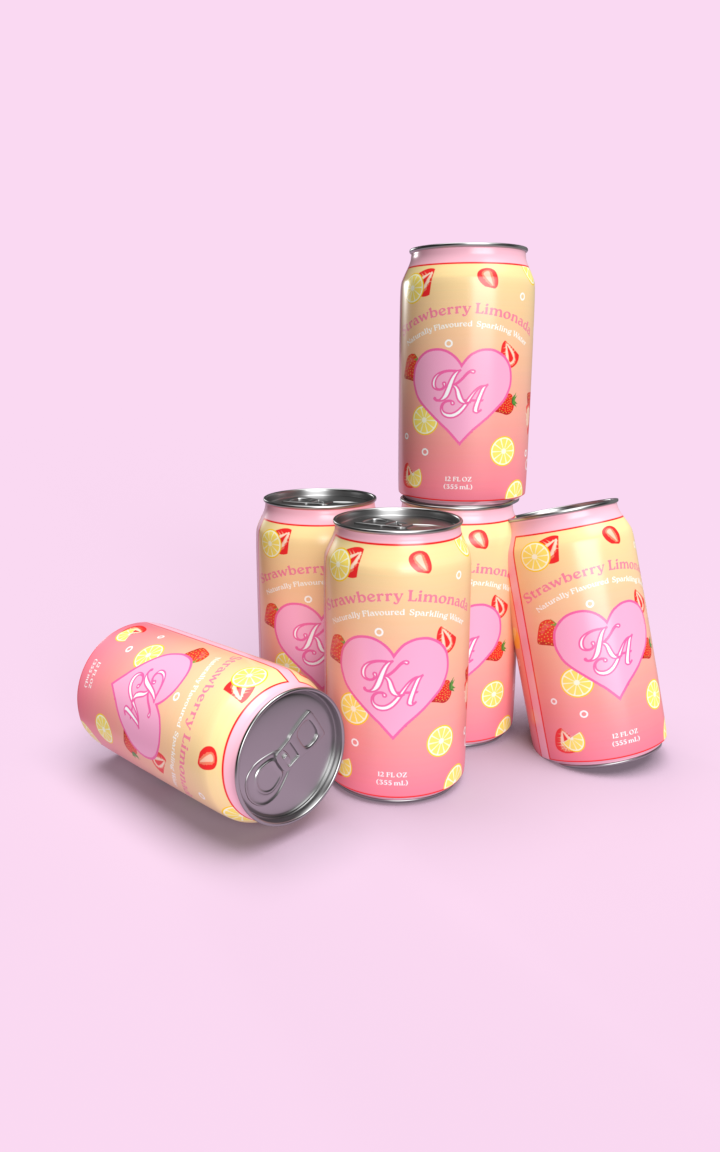
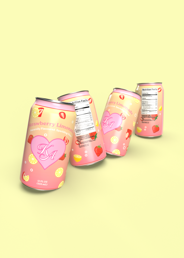
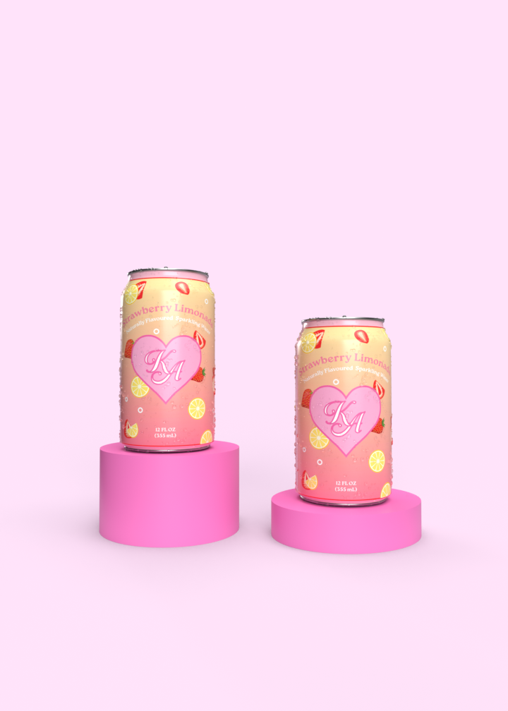
Kesy Can Design
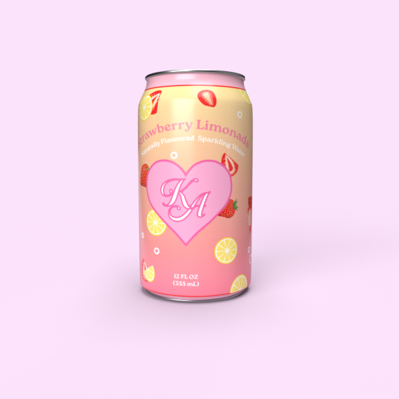
Inspired by Japanese Kawaii art, we designed a packaging that emphasized the natural elements of naturally flavoured water while keeping a light, feminine aesthetic. “Floating” fruit illustrations capture the illusion of the all natural ingredients and flavouring within Kesy. A light, fun colour palette that includes yellow and light pinks, keeps that light, friendly feel. While also being mindful of the typography choices that invoke a friendly atmosphere.